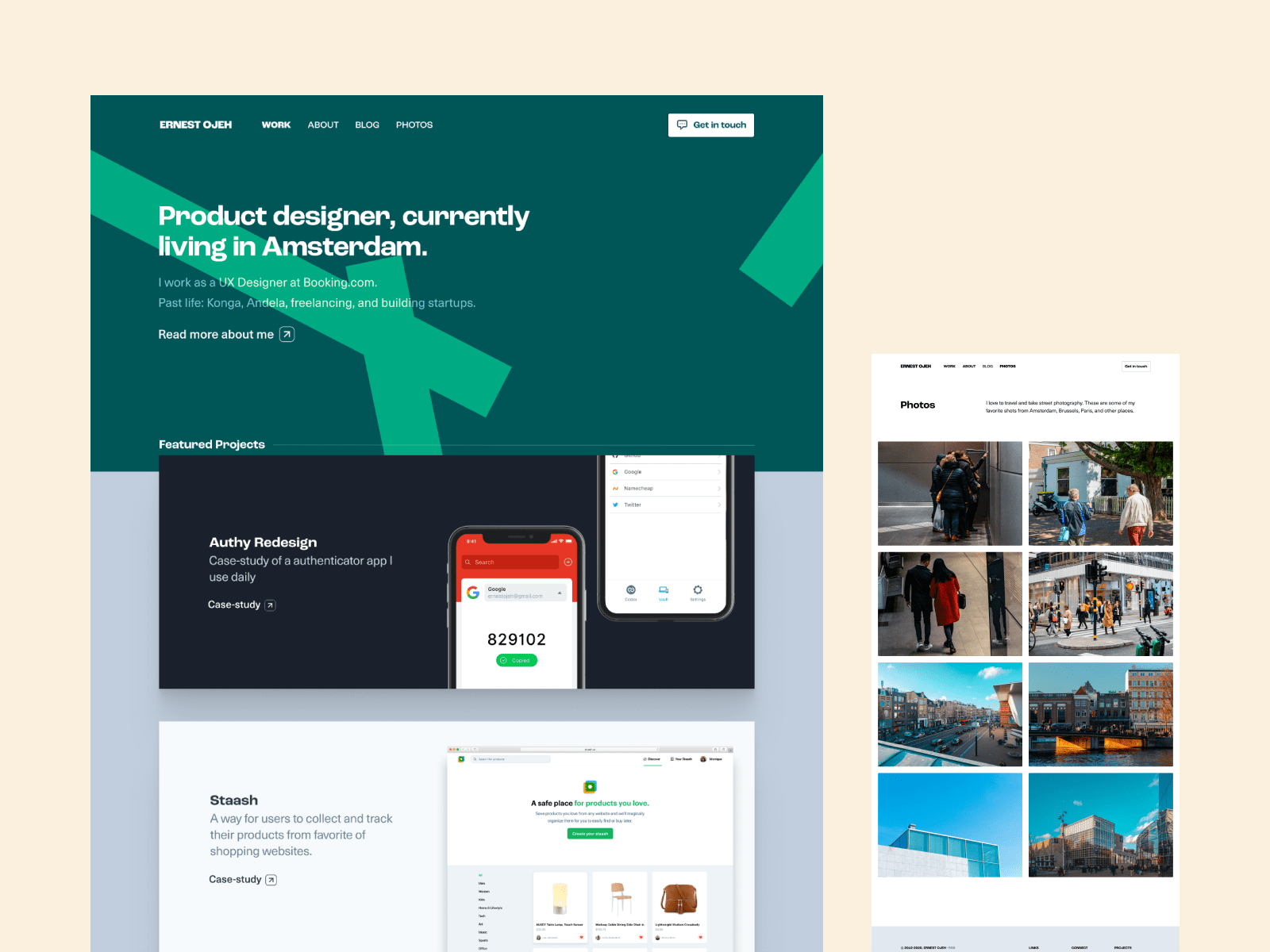
I recently started redesigning my website and for the first time, I didn't start by opening my code editor. All the previous versions of this site had mainly been designed in the browser and I wanted to approach this differently and put some more thought into the overall structure of the page and type of content I wanted to showcase.
This is more important to me now because moving forward I intend to treat this as my continuously evolving little corner of the internet, where I'll share things that inspire me, what I'm learning, creating etc, so it should be easily scalable.
Note: All this is still a work-in-progress and I'm figuring stuff out as I go, so if you have any tips, suggestions, or questions, please share them with me on Twitter.
Designing in Figma:
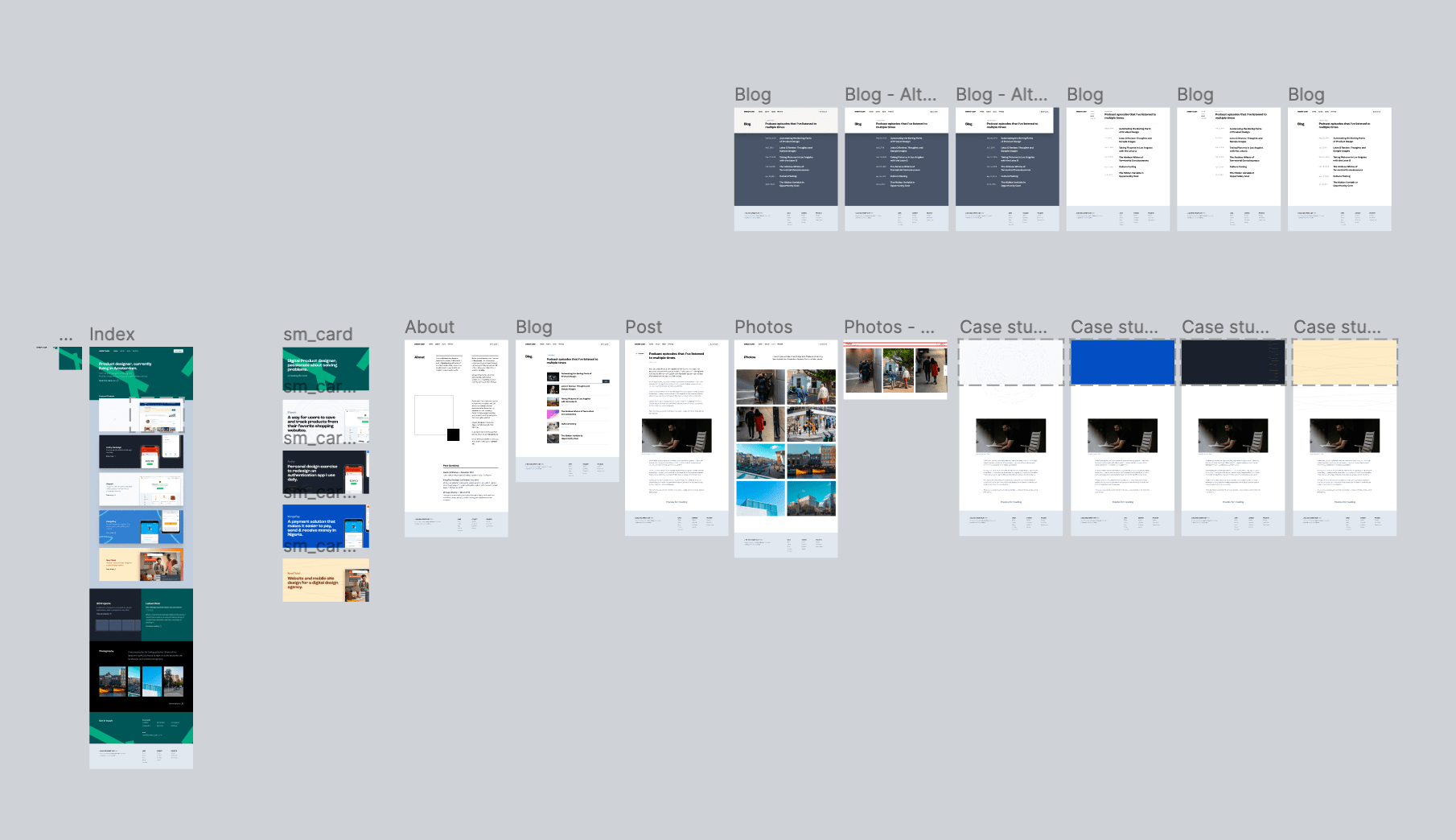
I created a lot of explorations before I choose the current design, one major role designing first played was to help in figuring out the grid I wanted to use, and what parts would be reusable (turned into components) when coding.
I had some idea of what I wanted the design and layout for the site to be, but I also got some inspiration from sites like httpster, hoverstates, and portfolio sites of designers I admire like Frank Chimero and Paul Stamatiou.
Typography:
I initially picked Roc grotesk for headings and Neue Haas Unica for the body font, but decided to use a single font for header and body, so I went with Monument Grotesk.
Sticking with Jekyll:
Jekyll is a static static site generator written in Ruby that transforms plain text files into websites or blogs. I love it because it doesn't come with the complexity of setting up a CMS, or databases and I love the idea of being able to create pages or blog posts on my site by pushing a markdown or html file to Github.
Switching from Skeleton to Tailwind:
For the previous version of my site, I used Skeleton which is a simple responsive CSS boilerplate - I basically used the grid and utility classes, it was light (only 11kb), and worked great but for this redesign I needed more modern and detailed framework that had things like CSS grid, flexbox, colors etc. So that's where Tailwind CSS comes in.
Before I decided on Tailwind, I was considering Tachyons or Bulma but I chose Tailwind because it seemed to fit my needs more and even though it may not be the lightest but I love how extendable it is, and also there are ways to purge unused styles.
To make setting up my new site easier, I used a Jekyll tailwind starter template (by @mhanberg)
Hosting:
Nothing changed here. My website is still hosted on Github, and deployed using Netlify.
Photo blog:
I used to use Netlify large media + GitLFS to store my photos and manually create new pages for photos (similar to blog posts), but I wanted something with less friction so I decided to move the photo part of this site to a separate repo and switched to using photostream (by @maxvoltar) - It's an opensource photo blog with cool features like lazy loading, managing image resolution depending on bandwidth, and it's easy to add a new photo - Just drop into a folder and it's file name becomes the url.
Next Steps:
I'm still working on it, but so far I'm happy with the base structure I have for now. Next I'm considering adding some interaction animations in a few places, optimizing images for mobile devices, and sharing some more posts that explains my process in detail.