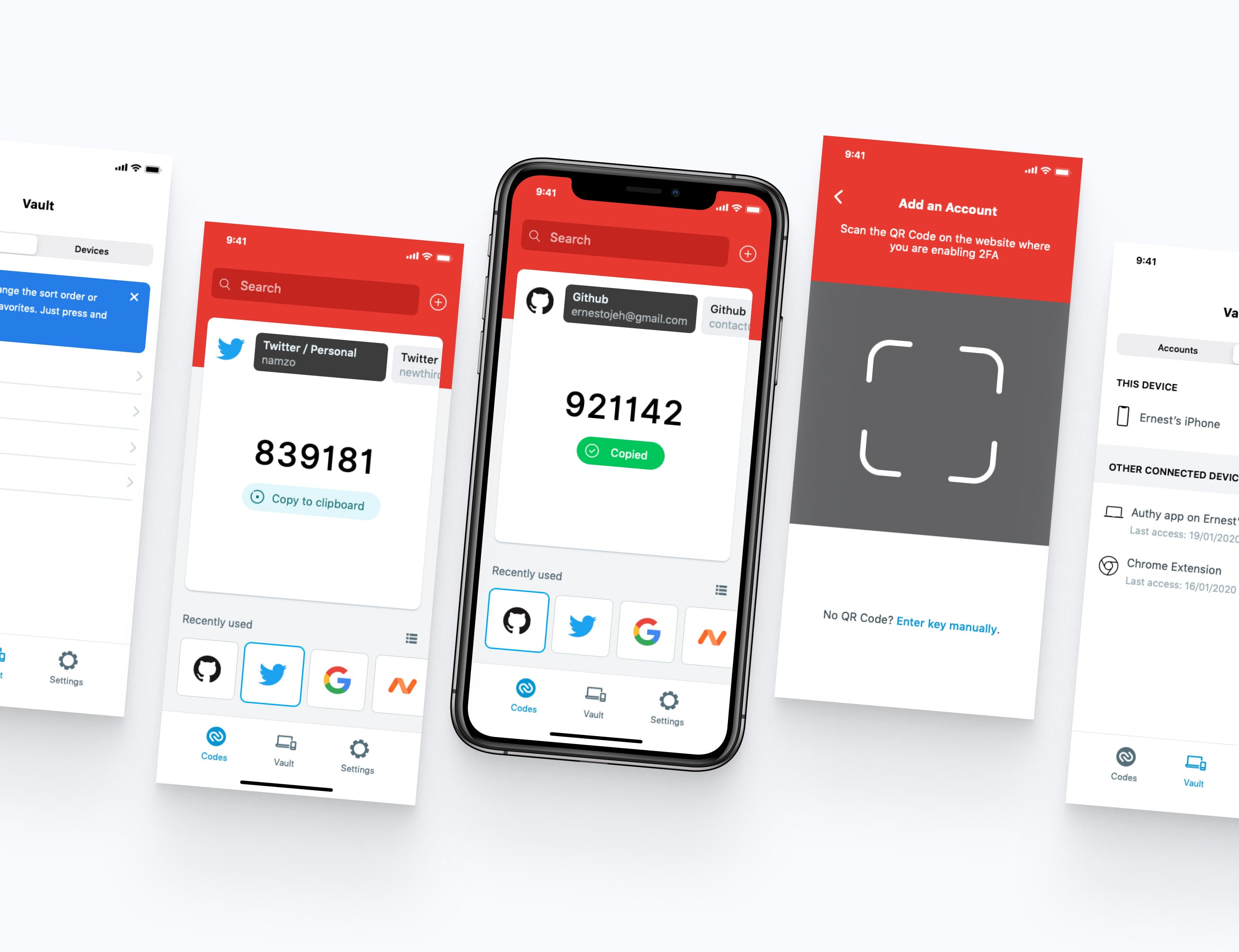
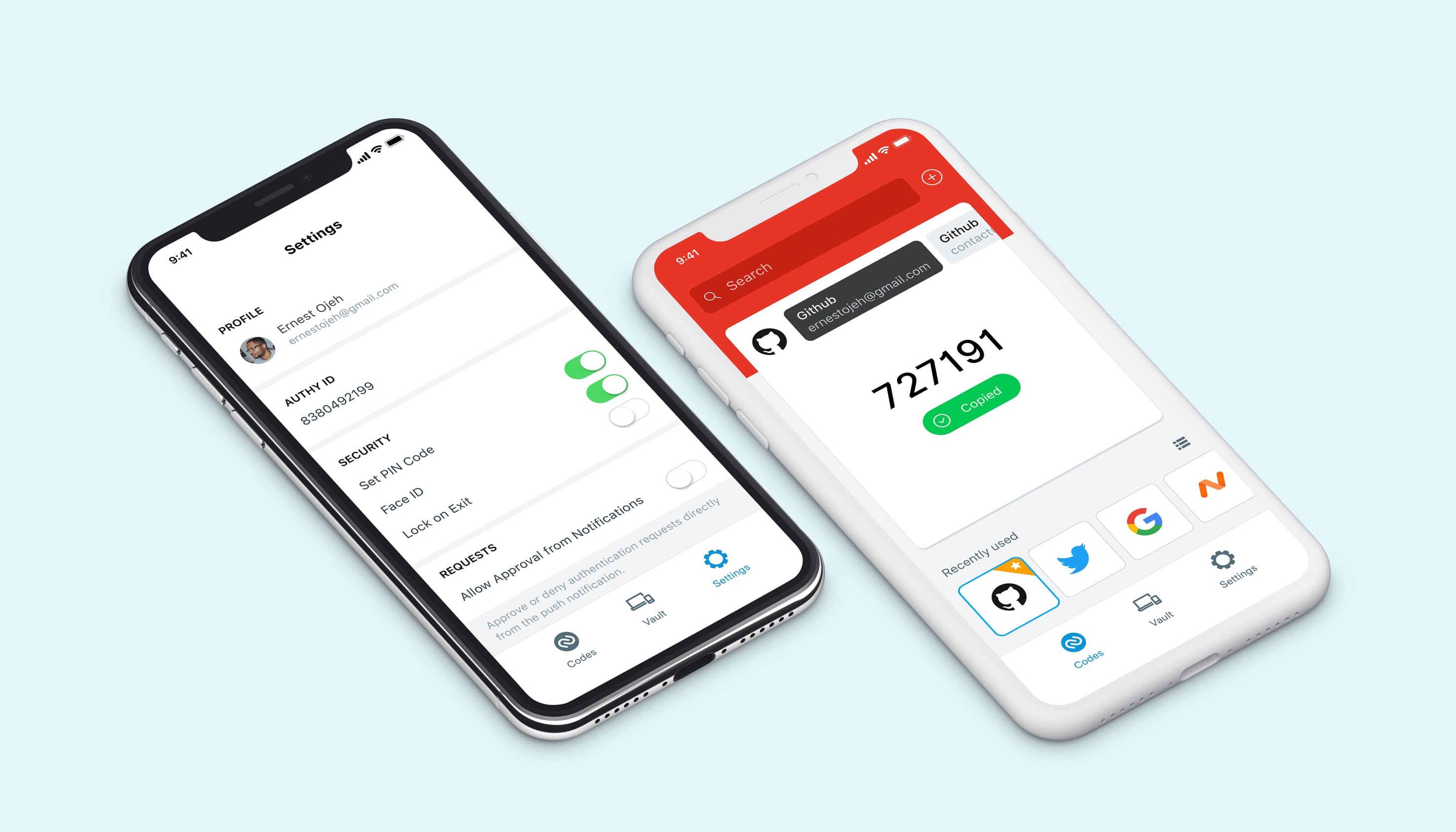
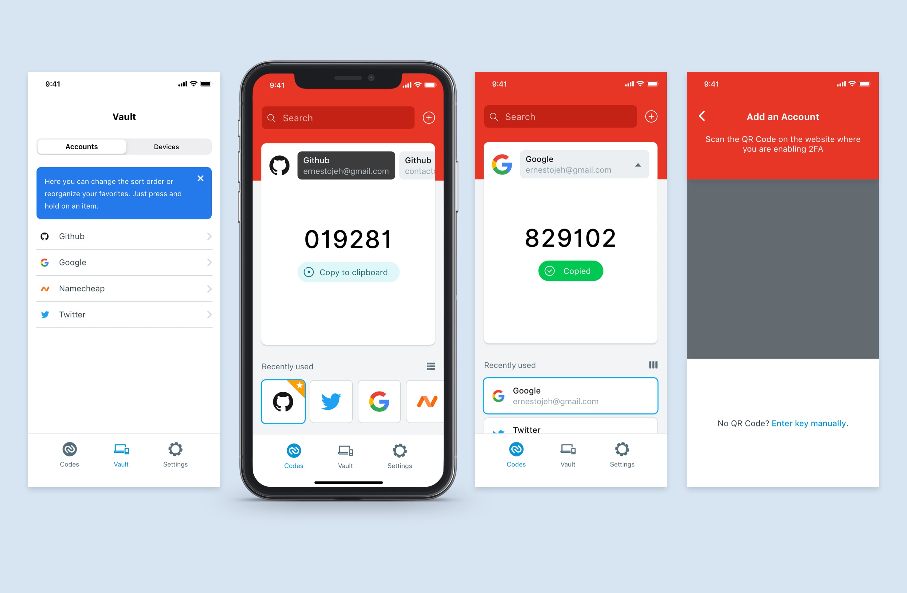
Authy Redesign
Mobile design, Prototyping, Concept
Personal design exercise to redesign an authentication app I use daily.

Context
Authy is an easy to use two-factor authentication service that secures and manages your online accounts using your smartphone or other devices. The app keeps all your tokens and secures them with a strong authentication.

The Challenge
Because I use this app multiple times daily to login to my various online accounts, I discovered a few friction points that I felt could use some improvements.
- How could I make it easier to add new authentication accounts faster?
- How could I make the apps navigation more accessible?
- How could I make it easier to manage multiple accounts from the same site / service? (IA)
- How could I make it faster to access and copy recently used codes?
- How could I make it easier to search for accounts?
- How could I make the user interface more delightful to use?

Identifying the painpoints
Besides the improvements I wanted to make, I decided to ask others what they would like see in their authentication app. I got some feedback from an online poll and on Twitter, and some of the feedback mirrored the initial problems I identified.
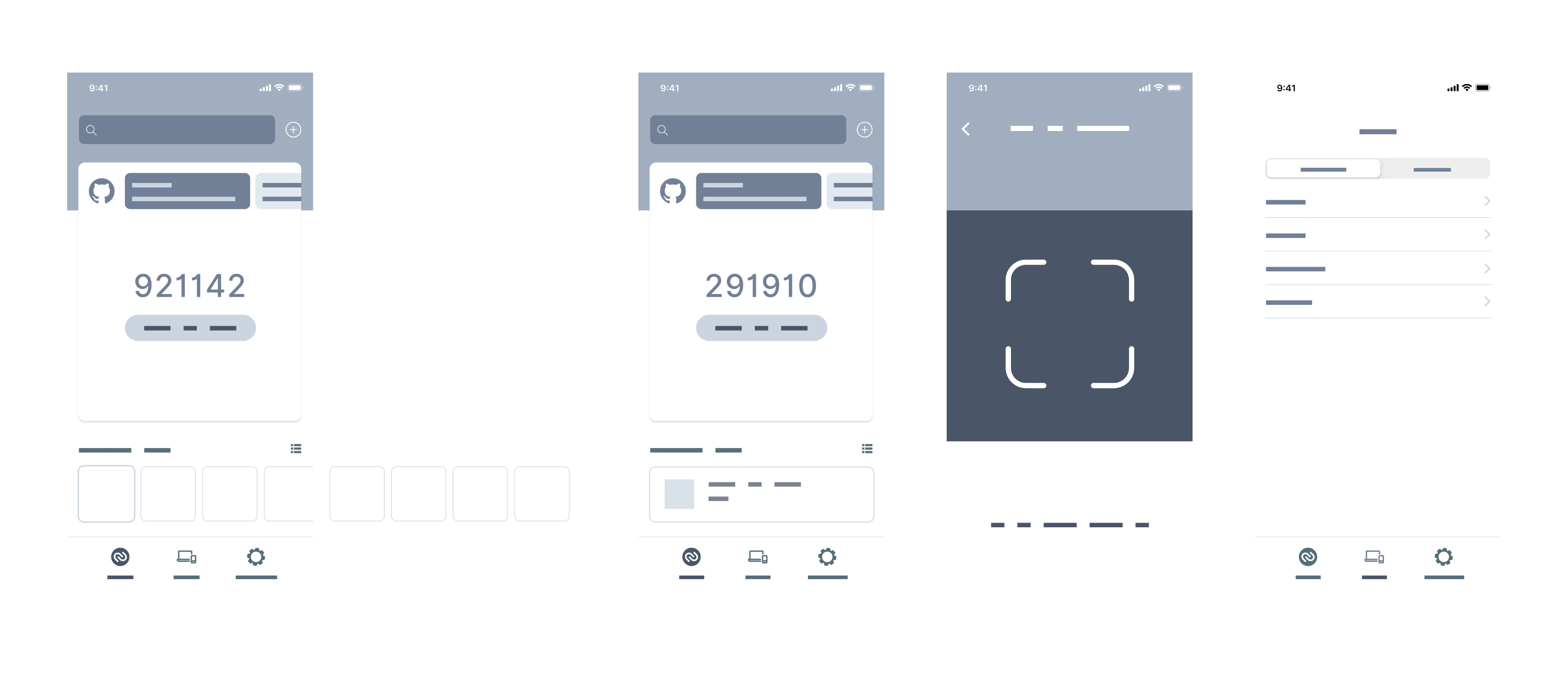
I went ahead to create some wireframes and proceeded to design and prototype the app.

Getting feedback
I wanted to make sure I didn't just solve my personal pain points with Authy, I also wanted to make sure I got feedback from others, so I asked on Twitter and also got some in-person feedback from other people who used other authentication apps.

Results
Authy was already a great app which I love using, and this was more of a personal exercise to build upon the work of the team, approach the design differently. In this case, the final product was a prototype which was done in Principle.